
Role
UI/UX Designer
Deliverables
Duration
8 weeks
About
Abrite Education is a fast‑growing online tutoring company offering personalized K–12 instruction across multiple subjects, as well as an online store of digital learning resources. Their mission centres on growth-driven education that supports both academic confidence and personal development.
The Challenge
Despite being a popular tutoring platform with a large social media following, Abrite's website was holding back their potential. The existing site was dense and text-heavy, making it difficult for users to easily scan for information, hindering lead conversion and sales. In addition, the site no longer reflected their evolving brand identity that was currently present in their social media channels. They required a cohesive web experience optimized to capture leads and drive digital product sales without losing their approachable, growth driven identity.
Analysis
Visual Hierarchy
While the site contained all the necessary information, the primary value proposition competed with other content. Without a clear visual hierarchy for supporting sections, users weren't able to quickly understand the company's offerings and unique approach.


Layout & Spacing
There were large areas of unintentional gaps that broke the flow across the site's pages. This made sections feel disconnected from one another, creating the risk that users would overlook important information.
Brand Perception
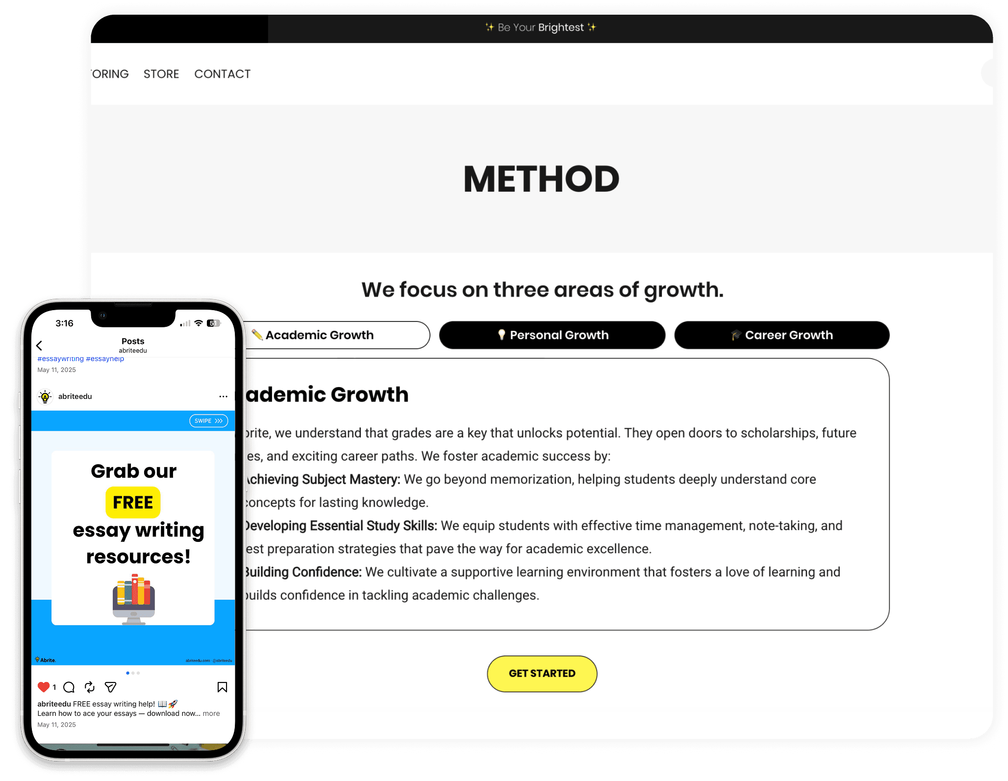
Abrite's social media presence utilized vibrant colours, playful graphics, and rounded shapes without strokes. These attributes did not match their current site, which created brand inconsistency and little cohesion across customer touchpoints.
Goals
Improve content hierarchy
Increase conversions
Establish a design system
Wireframes
Low fidelity wireframes were created to explore page structure, content hierarchy, and user flow. With the projects goals in mind, this phase focused on cleaning up the layout, improving information organization, and ensuring all CTA's were prominent across the site.


Design System
A basic design system was developed to bring consistency and structure to the redesign. Core elements including typography, colour, spacing, and reusable components were defined to create a consistent visual language and user experience across the site.


In addition to the standard colour system, a palette of vibrant colours was carefully curated to create unique identities for each teaching subject. These colours were also used throughout the site as accents for titles, backgrounds, and other visual elements.

The Redesign
Homepage
The redesigned homepage establishes a stronger visual connection to Abrite's existing brand while improving the organization of content throughout the page. Strategic use of typography, colour, and spacing creates a more clear user journey, guiding users through introductory messaging, metrics, subject offerings and more.

Subjects
Subject pages were designed with a more structured content hierarchy. Grade levels and available areas of study are clearly organized, allowing users to quickly understand whether a program meets their needs. In addition, dedicated subject theme colours help differentiate each discipline and give them their own unique identity.

Team
The tutor team page was redesigned to build trust and credibility through improved content organization and clearer presentation of instructor profiles. Consistent card sizing, hierarchy of information, and profile photos make it easier for users to learn more about Abrite's tutors and their backgrounds, helping to build trust and encourage conversion.

Store
Designed as a natural extension of the main site, the store experience combines a consistent visual language with a simplified shopping journey. Improved product organization, filtering, and product detail pages help users find the right resources and purchase with confidence.

Prototype
An interactive prototype was created to bring the redesign to life, demonstrating key interactions, navigation, and the overall user flow across the website.
Outcome
The redesign transformed Abrite's website into a more cohesive and scalable digital experience. By aligning the site with the company's broader brand identity, improving content hierarchy, and introducing a minimal design system, the new experience provides clearer pathways to information and key conversion points. The final interface better supports both educational content and digital products while maintaining Abrite's sense of approachability and vibrancy.


